Four front doors to "prove you're human"
Four live products ask a person to prove they are real. I looked at how each one opens: what it tells you, what it asks for first, and where it stops you.
This covers the front door and the approach, not a completed verification. No face, ID, phone number or Aadhaar number went into any of them. The screenshots were captured by an AI agent driving a real Chrome browser, on 26 September 2026, using a fresh browser profile. It typed nothing, uploaded nothing, granted no camera access and clicked no human check.
The four run from "show us your face and your ID" to "tell us nothing about yourself". How far each one lets you see before it asks for something is a design decision. It is also the finding.
Stripe Identity
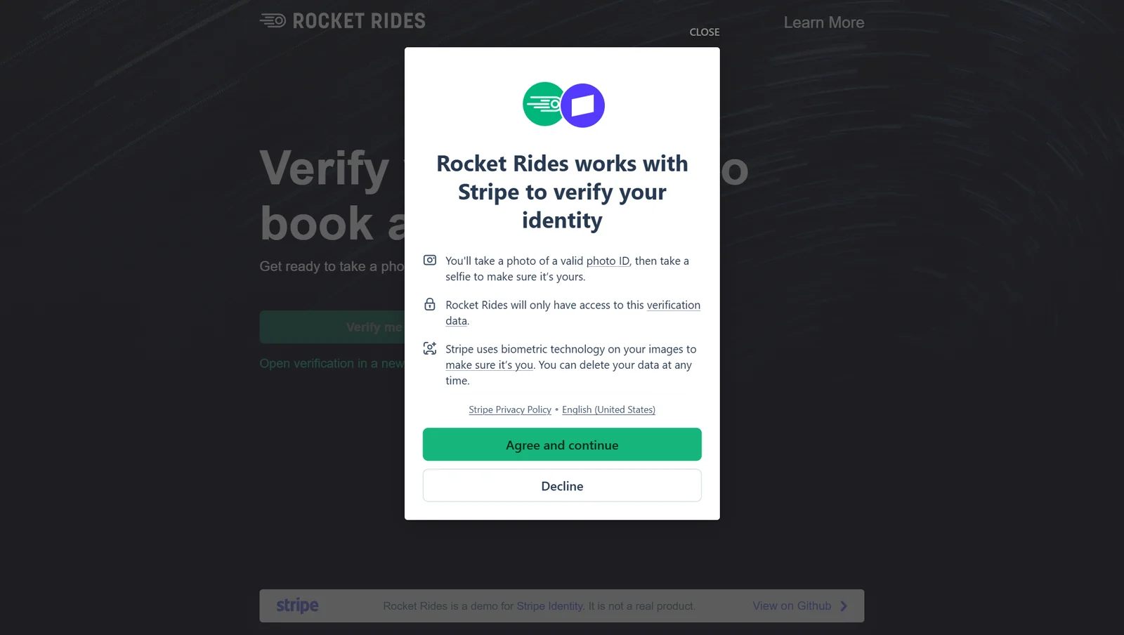
Stripe's public demo is a made-up ride company, Rocket Rides. The page says so: "It is not a real product." The session runs in Stripe's test mode (its link begins test_). The screen inside the modal is served from verify.stripe.com.
What the screen does
It tells you the whole plan before it asks for anything. A photo of a valid photo ID, then a selfie. "Rocket Rides will only have access to this verification data." "Stripe uses biometric technology on your images to make sure it's you. You can delete your data at any time." Then two full-width buttons: Agree and continue, and Decline.
Why it's built this way (my reading)
One screen, one clear yes, before the camera opens. It names each thing it will take, so the yes means something.
What's notable
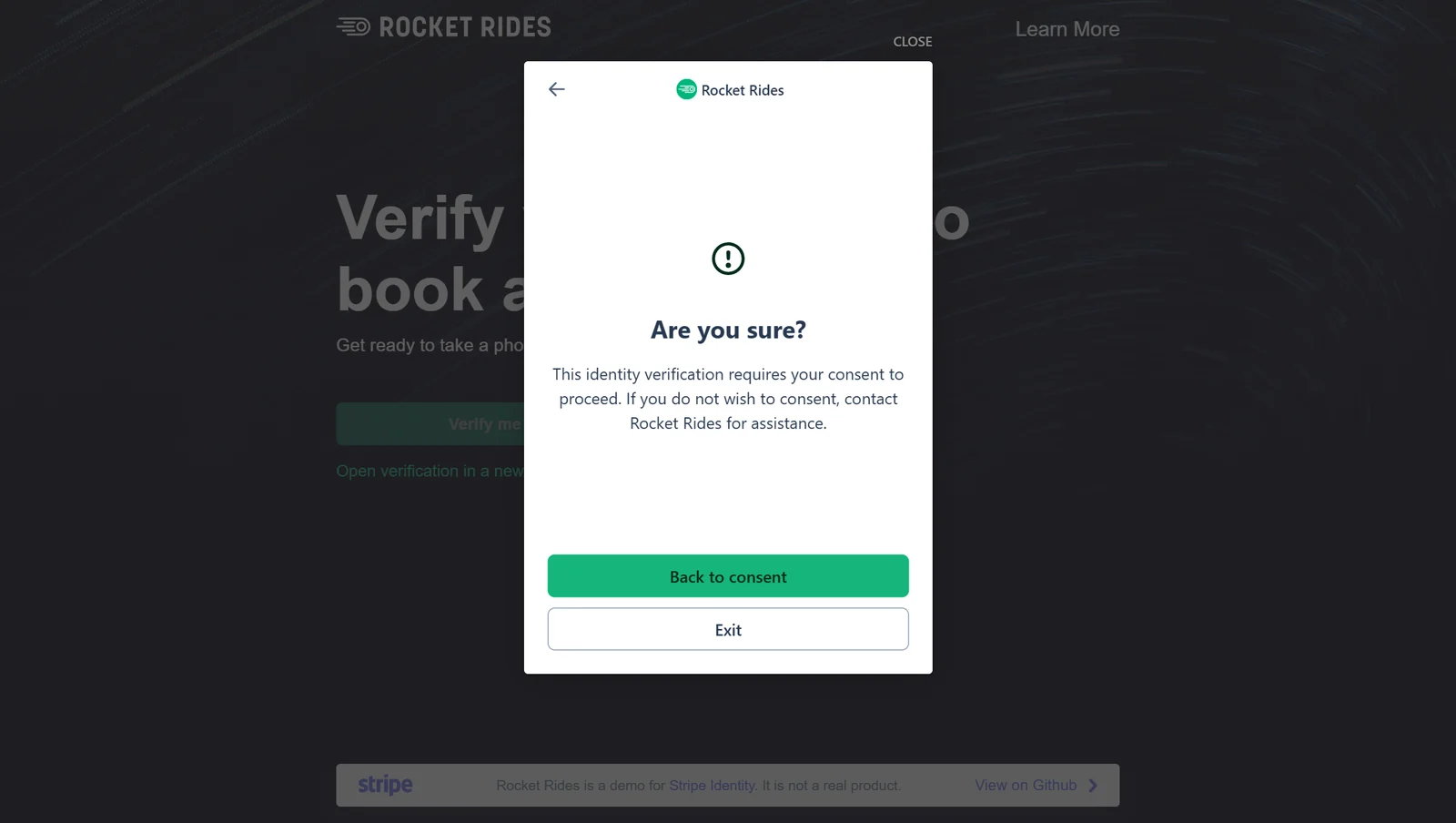
It explains more than any of the other three before asking. Decline is a real button, but it leads nowhere. It opens a second screen: "This identity verification requires your consent to proceed. If you do not wish to consent, contact Rocket Rides for assistance." The choices there are Back to consent, or Exit.
Stopped at
the consent screen. Agreeing to biometric processing is not the agent's call to make.
World ID
What the screen does
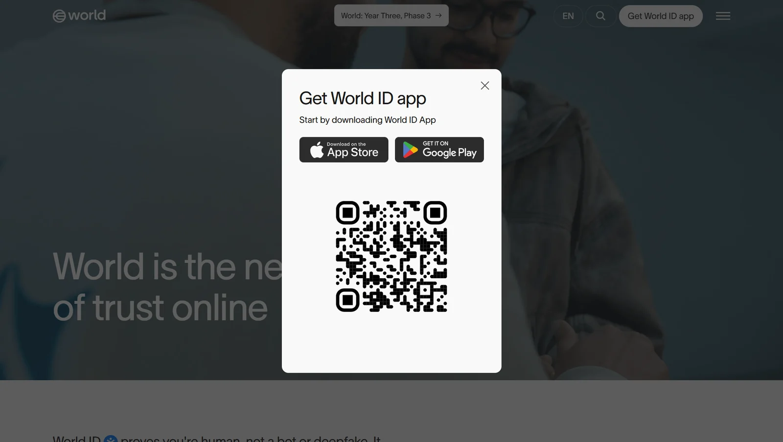
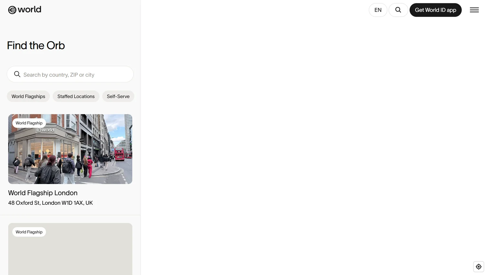
On world.org the first ask is not a form. It is an app. "Get World ID app" opens a modal that says "Start by downloading World ID App", with App Store and Google Play badges and a QR code for your phone. World's Orb page says the Orb "takes pictures of your face and eyes". The Find the Orb page lists places you go in person: flagships in London and Munich, staffed and self-serve locations, and a search box for country, ZIP or city.
Why it's built this way (my reading)
The proof needs a device in a room. A browser can't do that part. So the website's only job is to hand you to the app.
What's notable
On the website I found no way to start the check. It only points you elsewhere. The default Orb list showed no location in India. I didn't search, because searching means typing. The map on the Find the Orb page was blank when captured. I could not verify why.
Stopped at
the app download. Installing an app is outside the rules for this piece.
Cloudflare Turnstile
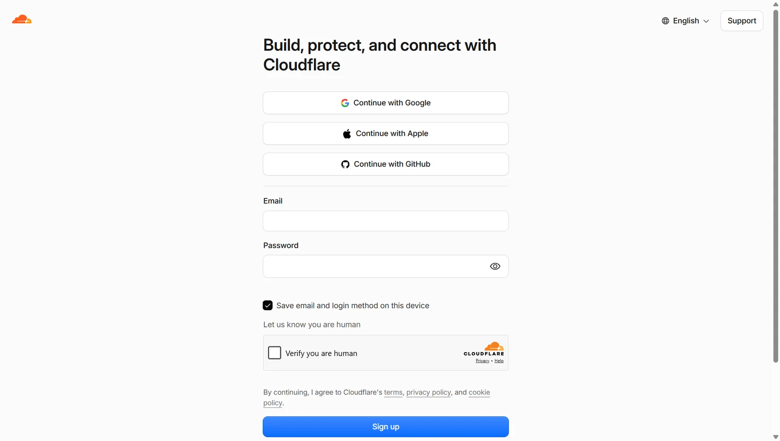
Turnstile sits on Cloudflare's own sign-up page, dash.cloudflare.com/sign-up, under the line "Let us know you are human".
What the screen does
It asks for nothing about you. No name, no document, no face. The page opened at 08:29. The first two captures, a few seconds apart, show an empty space where the widget sits. A later one shows "Verify you are human" with no box. The capture at 08:30:47 shows the checkbox.
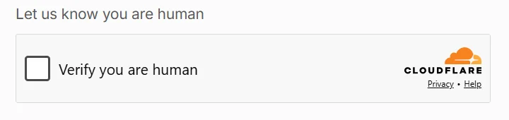
Why it's built this way (my reading)
Run the check quietly first. Ask for a click only when it isn't sure. For most people that should cost nothing.
What's notable
It asks for the least, and it still drew a box in front of this browser. The browser was being driven by software, which is the thing Turnstile exists to catch. That may be why the box appeared. I could not verify it. One more detail on the same page: "Save email and login method on this device" was ticked by default.
Stopped at
the "Verify you are human" checkbox. An AI clicking it would defeat the point of the check and of this piece.
DigiLocker
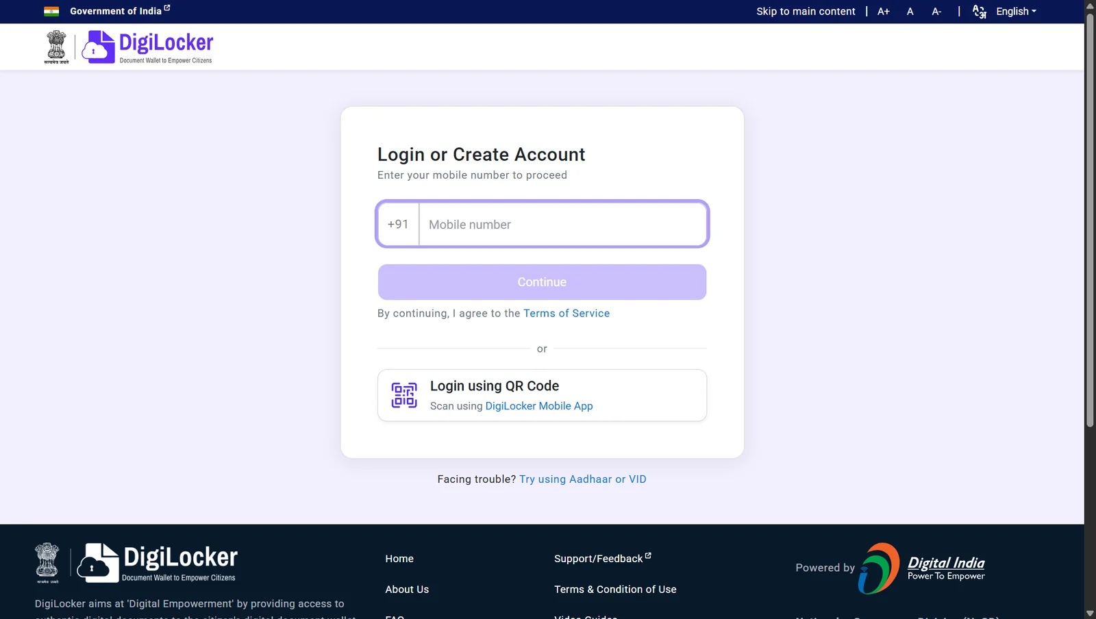
DigiLocker's own tagline is "Document Wallet to Empower Citizens". Login / Register on digilocker.gov.in leads to accounts.digilocker.gov.in.
What the screen does
The first screen asks for a mobile number, with +91 already in place and the field outlined, ready for typing. "By continuing, I agree to the Terms of Service." The other routes: log in by scanning a QR code with the DigiLocker app, or "Try using Aadhaar or VID". That link swaps the field for an Aadhaar or VID number, with an eye icon beside it.
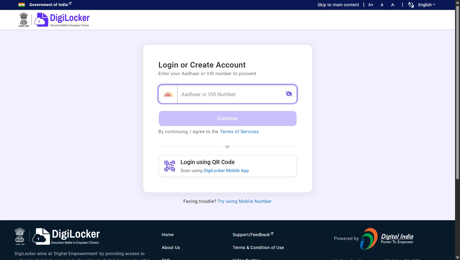
Why it's built this way (my reading)
It isn't asking you to prove you're human from scratch. It is asking for one key it can look you up by.
What's notable
It asks first and explains nothing. Nothing on either screen says what happens after Continue. Both versions of the form carry hidden fields named lat, lng and fp_token. They were empty when I looked, and I could not verify what fills them. A small one: the mobile screen links "Terms of Service", the Aadhaar screen "Terms of Services".
Stopped at
the mobile number field. Entering a phone or Aadhaar number is out.
What the front doors show
What a product asks for and what it explains don't move together. Stripe asks for the most and explains the most, all before the first yes. DigiLocker asks for an identifier on screen one and explains nothing. World can't ask for anything in a browser. Turnstile asks for nothing about you, and still put a checkbox in front of an automated browser.
Of the three that want something from you, only Stripe tells you the whole trade before asking you to make it.
Rish Sadh, founder of Reidify, an AI-first design studio in Mumbai.